Random Accessibility Tip #072: Underlined Links
I posted a small random accessibility tip on LinkedIn a couple of days ago.
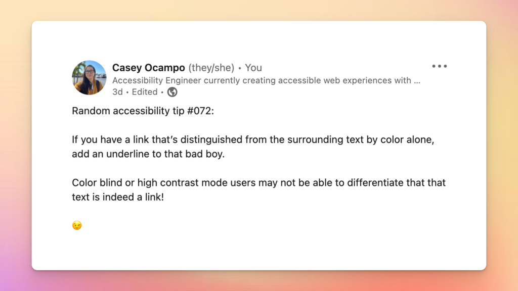
“Random Accessibility Tip #072:
If you have a link that’s distinguished from the surrounding text by color alone, add an underline to that bad boy.
Color blind or high contrast mode users may not be able to differentiate that that text is indeed a link!”
Chatting About Web Accessibility Online
Like most of the stuff I write, I kept it jargon-free and playful as if I were chatting with a friend. I like to think that makes my writing easy to read and relatable at the same time.
Although I’ve chatted about accessibility on social media before, this was the first time I posted an accessibility tip on my LinkedIn account.
What was interesting about the post was that there was traction among non-accessibility professionals (though my super rad co-worker and Accessibility Engineer, Sophia, did “heart” it).
Some other folks who reacted to the post hold job titles like Digital Marketing Strategist, Senior Graphic Designer, Account Director, and Web Director.
(If you’re one of those folks who reacted to that post and are reading this now, hello!).
The post also currently has over 500 impressions at the time of writing.
This got me thinking.
Maybe if I post small, easy-to-digest random accessibility tips on the web, then maybe a spark of curiosity could ignite in folks who wouldn’t have known about web accessibility otherwise.
Following up on the random accessibility tips on this site
I’m going to experiment with following up on those small accessibility tips here on my site.
I’m thinking maybe I could provide examples of the tips in action and to compare, provide examples of things without accessibility.
I also plan on sharing links to the WCAG guidelines for those curious enough to dig a little deeper.
Another thing I want to do is create a skimmable structure for these posts so readers can easily jump to the tip, examples, and relevant guidelines.
For this article, the accessibility tip was already mentioned in the beginning!
Read on for examples and the relevant WCAG guideline.
Examples
The following examples show text without and with accessibility in mind.
Note: the example text was created by jeffsum.com a text placeholder generator in the voice of Jeff Goldblum.
Also note, the example below does not actually contain links as I do not want to provide random or empty links to screen reader users.
Example #1: a link using only color to distinguish that it is a link from surrounding text
“So you two dig up, dig up dinosaurs? Just my luck, no ice. We gotta burn the rainforest, dump toxic waste, pollute the air, and rip up the OZONE! ‘Cause maybe if we screw up this planet enough, they won’t want it anymore!”
Example #2: a link using a non-color identifier (an underline) to distinguish it from surrounding text
“So you two dig up, dig up dinosaurs? Just my luck, no ice. We gotta burn the rainforest, dump toxic waste, pollute the air, and rip up the OZONE! ‘Cause maybe if we screw up this planet enough, they won’t want it anymore!”
Testing the examples in high-contrast mode
For those curious about testing these two examples in high contrast mode, check out Chrome’s High Contrast browser extension.
There are also browser extensions available for Firefox. Regarding Safari/Mac users, you can enable high contrast mode in the system settings.
Whichever browser you use, play around with the different modes. You’ll see that there are several contrast mode options that would make the color-only (the one without the underline) link indistinguishable from the surrounding text!
Relevant WCAG Guideline(s)
The relevant WCAG guideline for Random Accessibility Tip #072: Underlined Links is 1.4.11 Use of Color in WCAG 2.1.