How to Think About Button Labels and Accessibility
If you were in an elevator that didn’t have floor numbers on the buttons, would you press one?
What about if those buttons weren’t in ascending order? Maybe they’re in descending order?
What if you pressed the fourth button from the bottom left with the expectation to land on the fourth floor, only to be taken to floor 11?
Even more, if the open and close elevator buttons weren’t labeled, how would that make you feel?
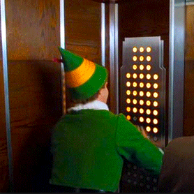
Unless you’re Buddy the Elf, I’d wager most folks would feel frustrated, trapped, confused, and so on.
The analogies I’m drawing here of course correlate to HTML button elements without accessible names and buttons appearing in a different order than how they are structured in the DOM (Document Object Model).
You can guarantee that if a user comes to your site but can’t figure out where they are on your site or what action a button is doing, they’re going to leave.
This isn’t the outcome the business or the user wants. But, the good thing is that it’s actually pretty easy to fix.
There are two main things to keep in mind regarding buttons.
- Giving buttons accessible names
- Making sure the DOM order matches the visual hierarchy
Note: there are scenarios where buttons require aria attributes such as aria-expanded or aria-pressed but for now, we’re leaving ARIA out of the conversation … except for aria-label.
Give buttons accessible names
Ideally, we’ll want to get ahead of the game by ensuring that all buttons must have accessible names in the design phase. That way we avoid technical accessibility debt by having it right from the start.
During that design phase, we can think about making button labels accessible in four different ways:
- HTML text
- alt text
- screen reader-only text
- aria-label
HTML text example
<button>Lorem Ipsum</button>
This is ideal as the button text is available visibly and to screen readers.
Alt text example
<button>
  <svg alt="lorem ipsum"></svg>
</button>
Screen reader-only text example
<button>
  <span class="sr-only">Lorem ipsum</span>
  <svg aria-hidden="true"></svg>
</button>
For screen reader-only text, we can use a <span> tag with a screen reader-only class on it to hide it visually but still have it available for screen readers.
Notice how we added an aria-hidden=”true”. This is because we’ll want to hide the image information from screen readers since we’re adding screen reader-only text to describe its purpose.
Aria-label example
<button>
  <svg aria-label="lorem ipsum"></svg>
</button>
Both the image alt text and aria-label are options one might choose if their button only contained an icon.
Which accessible name options are the best?
Regular HTML text is undoubtedly the best option as we don’t need to add any aria attributes or extra code like screen reader-only CSS.
The second best option is tied between screen reader-only text and the alt text attribute. The reason is that screen reader-only is guaranteed to translate to different languages as it’s HTML text, just hidden visually. It will translate like the rest of the HTML text.
The alt attribute should also be able to translate different languages. I’ve done my own personal testing on this and haven’t seen any known issues for language translations in alt attributes.
Lastly, aria-labels have issues with being translated across different browsers so to avoid inconsistent experiences, use this aria-label attribute sparingly.
From here, choose an option that suits the button design best and add a note for the developers to use whichever option you chose.
Ensure the visual order matches the DOM order
Moving on to DOM order.
If you didn’t already know, the order in the DOM created the tab order. We’ll want to be sure that the DOM order matches the visual hierarchy.
A CSS technique to look out for that may break the logical order is Flexbox’s order property.

Flexbox order example from css-tricks.com
The purpose of this property is to move an element out of order visually. As you can imagine, this can cause some confusion, say if you reordered buttons.
The best thing to do if a reordering of buttons (or anything else) is needed is to reorder it directly in the DOM and then update styles accordingly if need be.
The information in this article is based on personal testing and information on known issues published online. However, if you see something incorrect, please contact me and I will update this article.